Discover Card Online Privacy Protection


Many customers face the issue of having their personal information captured and sold on people-search sites. These sites are predatory and can lead to data breaches and other risks to users. Discover Card has decided to create a free service which automatically monitors and removes user information from people finder sites.
The Online Privacy Protection product (OPP) is a free tool made available by Discover Financial Services which helps promote data security and safety for its customers. The product scans various people-search sites - websites which broker personal data, many times without customers' knowledge - and automatically removes a user's personal data from those sites. OPP scans, locates and automatically removes risky data over a 91 day period.
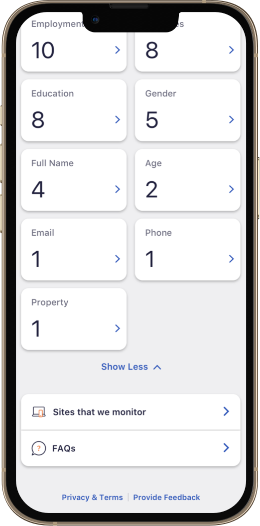
Users will have access to the OPP dashboard which will show the status of the scan, the total number of records removed during the scan, and a running list of key information which had been successfully removed from these sites.
OPP has been developed and is currently undergoing an internal pilot before going live on the Discover Card app.
When our Discover clients first approached us with the brief to design the OPP product, an interesting problem began presenting itself. The product is an altruistic offering from Discover to its customers. It builds trust and loyalty and rewards users with very real and useful data protection. However, the way with which the product delivers on its promise could lead to potential confusion.
The product performs a scan quarterly, removing personal information from risky sites. When the quarter ends, the scan begins once more, cataloguing all past found and removed records as well as displaying new records which were currently in the removal phase.
The design team hypothesized that users would assume the scan ran every time they accessed the product rather than understanding it was an ongoing scan which ran quarterly. This could leave users confused and lead them to question the usefullness of the product.
The Ask
Our team was tasked to design an onboarding experience as well as a product dashboard which would provide a real time tracker of personal information found and subsequently removed from people-search sites. Discover wanted users to easily access and opt in to the product while also providing enough information to convince users that OPP was effective in protecting their data.
The client desired a direct, quick and clear onboarding experience which would inform the user about how OPP worked, what the benefits of opting in where and why people-search sites proved dangerous to user's personal data. After some initial design rounds and client reviews the design team decided that a 2 screen onboarding solution which combined easily digestible information as well as a brief but useful FAQ section would be enough of a motivator to convince users to opt in.


Once users successfully opted in to OPP, they would gain access to a dashboard which would immediately run a preliminary scan for the user's personal information on 10 popular people-search sites. The dashboard design had to visually establish action, display and explain the status of the current scan, and ultimately show the results of the scan in a simple and effective format. Similarly, the design had to easily define to users the two states of the scan process:
1.) Removals which were currently in progress - meaning records which were found on sites and were in the process of being removed.
2.) Records which had successfully removed.
Because the scan ran over the period of 91 days, or once per quarter, the design had to be evocative enough to inform users that a process was running behind the scenes as well as provide real time results with enough context to inform users where their data was circulating.
The design team ideated various versions of the dashboard and ultimately landed on a design which gave priority to the status states of the scan.


Once results began populating the dashboard, the experience needed to give users more context and insight into what kind of records where being found and removed. A user would be able to tap the 'In Progress' and 'Completed' UI elements and drill down into a more itemized, contextual view on a 'Scan Details' page. The subsequent screen would populate scan results and highlight the record types which were found. A user could then tap one of the categories and see the instances of where their personal information appeared on a people-search site.


Because the scan runs quarterly, the design team needed to create a success state informing the user of a successful scan removal period. The dashboard design needed to use UI elements to inform the user of a completed scan, as well as display the time period over which the scan had run.
